Are you tired of getting unsubscribe notices from your former subscribers? When you spend so much time, money, and effort on your leads generation pages, it’s hard to see subscribers decide to go.
When they do, you may just have one chance to win them back. It takes some unique planning to create a captivating unsubscribe page that may change their mind about unsubscribing. How can you do this in a classy and memorable way? Should you provide them with a list of all of the products or services they are abandoning and will not be bombarded with each week or month? Should you give them a presentation as to why you shouldn’t go? Perhaps not. But some companies do more than that. They make it sound like a romance. They force you to decide whether you want to cut ties forever, or just need a break. Many offer options as to how much of “a relationship” you want.
Below are some great examples of companies who have an unforgettable unsubscribe page that may make potential unsubscribers take a second look before they turn to go.

Barkbox
Barkbox, as you may have guessed, deals with puppies. They sell dog treats, special doggie biscuits, and dog gifts.
So when you try to unsubscribe, you get a sad Boston Terrier puppy looking back at you saying, “You can never have too much puppy love.”
Pet owners and others alike should be moved to tears at the idea that you are leaving a puppy like this behind! It plays a trick on the mind as you start to unsubscribe and plays on your sentimental side. Who hasn’t left on vacation to see a sad puppy looking back at them as if beckoning them to stay? Yep, this one sure worked on me. I am not a current subscriber of Barkbox, but if I were, I still would be!
Nordstrom’s
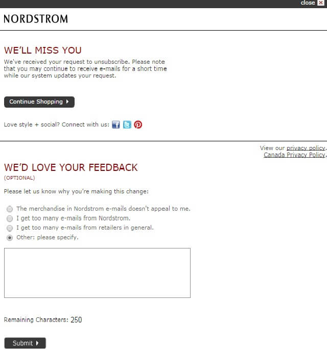
Nordstrom’s features a unique unsubscribe page that lets you unsubscribe easily at the top while stating, “We’ll miss you.” Then the bottom part asks what they can do to improve their service.
It features some radio buttons that have the following options:
- The merchandise doesn’t appeal to me.
- I get too many emails from Nordstrom’s.
- I get too many emails from retailers in general.
- Other: Please specify.
This list of choices that are presented at the unsubscribe page adds more detail and asks for information from the unsubscribe member to help the company figure out why you left their email list and what they can do to improve it.
The first option tells them you may not be a good fit for their products. The second choice shows them they may be sending out too many mailings. The third option indicates that you just get too many sales emails in general and the last one allows people who are wordier (like this writer) to specify. This can provide valuable insight as to the reasons why people leave.
This is a simple form that users can fill out in just thirty seconds or less, but it gives Nordstrom a lot of information about why subscribers are leaving and helps them to fine-tune their email campaigns. The more you know about why your subscribers are leaving, the better you can hang onto them in the future.
Bonobos
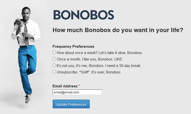
Another great unsubscribe page is brought to you by Bonobos, a clothing company that specializes in men’s clothing that borders on the trendy side. On their unsubscribe page, they have the following options:
- Once per week. Let’s take it slow.
- Once a month. I like you, Bonobos. LIKE.
- It’s not you, Bonobos. It’s me. I need a 30-day break.
- Unsubscribe. It’s over, Bonobos.
Users most likely laugh at these options when they are about to unsubscribe, and it wouldn’t surprise me if some stayed just because of the humor element in this witty unsubscribe banter. It almost sounds like a romance. In fact, that’s exactly what it sounds like. The user has to think about what they want their relationship to be with the Bonobos company before making a decision, kind of like deciding how close of a relationship you want with a member of the opposite sex.
They should serve popcorn with this opt-out.
Costco’s
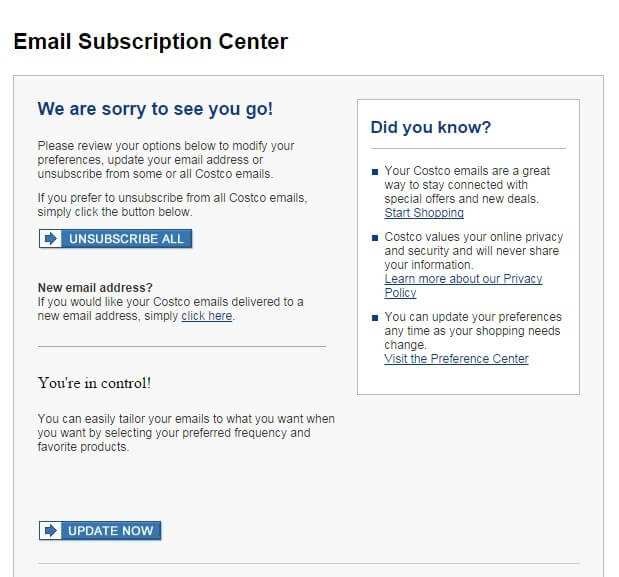
Costco’s unsubscribe is an interesting study in human psychology. The owners of Costco’s clearly understand the idea of empowerment. They have a statement at the bottom that says, “You are in control!” Then you have options for opting out and only receiving what you want to receive.
This may prove successful in hanging onto some subscribers who are on the fence about whether to keep it but it does require them to go to one more page to create their preferences. The idea is to keep them on the page long enough to consider their decision to leave and perhaps, convince them to stay. (Insert theme from “Love Story” here.)
HubSpot
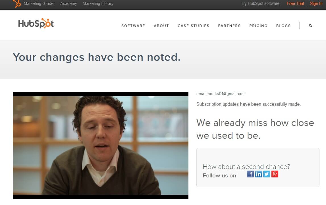
HubSpot has a unique take on an opt-out page. There’s a guy on a video asking you to stay, almost like a lover would tell you how much he loves you to try to get you not to pack your bags and move out of your shared apartment.
You’ll need tissues for this and I have to wonder if this guy does this for a living. But I’m reminded that he is sincere when I see the tag line on the opt-out page with the wording, “We already miss how close we used to be.”
You can’t get more romantic than that!
JetSetter
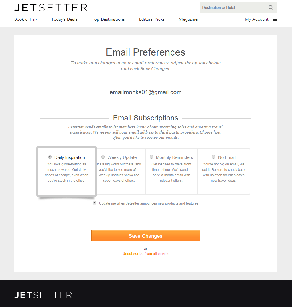
JetSetter has a great unsubscribe page because it doesn’t just let you first unsubscribe and say goodbye forever. Instead, they offer a slew of options to choose from — after all, most people are unsubscribing because they don’t want to get a lot of email often. However, if you give them the option to limit how many emails they are going to receive, it’s much more likely they will stick around.
This is something nearly any website or mailing list can implement. All it takes is setting up a few more mailing lists and simply mailing out less often. In the case of JetSetter, mailings are sent out on a daily, weekly or monthly basis. The option is also there to completely unsubscribe.
Abercrombie & Fitch
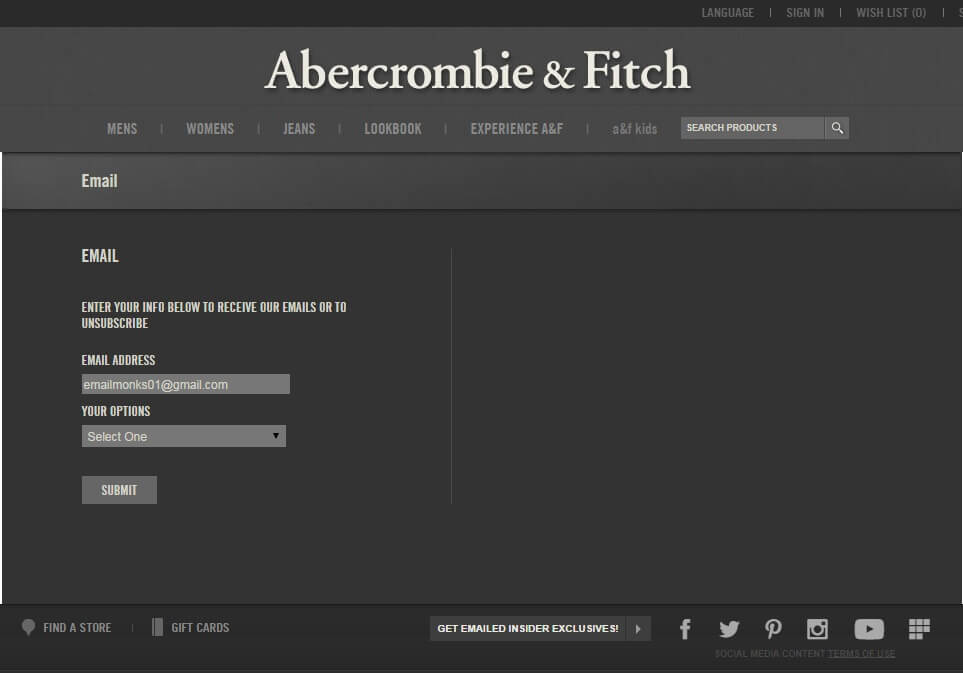
Doesn’t anyone just cut to the chase anymore? You either want to subscribe, or you don’t. Why do they have to plead like a high school lovesick boy to get you to stay? You don’t have time for this, right? You have real relationships to nurture.
A good example of this is when you unsubscribe from Abercrombie & Fitch, you don’t get any of the crying, any of the begging, or any of the drama! In fact, just the opposite. They have a stoic, businesslike page that looks formal and straightforward and lets you unsubscribe quickly and easily with just two or three clicks.
For even more examples of popular unsubscribe pages, be sure to check out this article from Hubspot as well.
It’s Not Just About Your Unsubscribe Page
You might have the greatest unsubscribe page in the world, but people are still going to constantly join and leave your list. For this reason, you need to actively grow your mailing list as fast and as often as possible. To help with this process, discover how AfterOffers.com can start delivery hundreds of opt-in email addresses to your mailing list daily.
