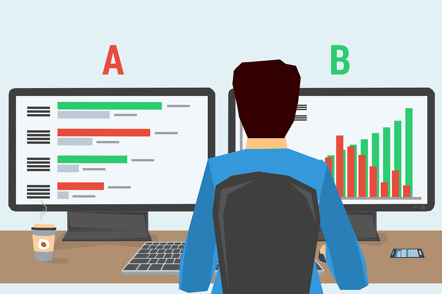
Email optimization can be done in a variety of ways. Email marketers and business owners should keep in mind that sometimes just changing one detail or factor can make a huge difference in clicks and conversions.
To help with this process, we’ve highlighted ten examples of successful email campaign experiments show the power of one thing in increasing conversions. Be sure to take the time to read through each of them, as they are all unique and have found split testing results that can help improve your email marketing as well.
Kiva.org
Kiva.org created a case study on email optimization that showed that changing the subject line of an email increased click-through rates at the rate of 2.57%. Kiva wanted to see if the word, “Merry Christmas” got more clicks than “Happy Holidays.” They also wanted to see if some combination of the two phrases got better results. The results were that “Merry Christmas” got the most clicks with Happy Holidays coming in second.
Results:
Kiva performed this case study by using an A/B Split Test with two groups to test the results. This information gave them a better idea of what worked to increase conversions.
Sony Vaio
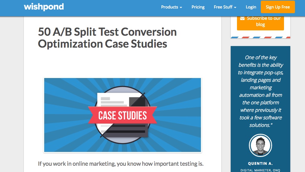
Sony Vaio conducted a similar test with banner ads to see if using a personalized banner ad increased the conversion rates in emails. The original ad featured two calls-to-action. One of them said, “Make it personal” and the other said, “Customize your VAIO.” Sony was testing to see which banner worked better. They were in interested in both the banner as well as the wording.
Results:
The results showed that the personalized call-to-action ads increased the click through rate by 6% and conversions by 21.3%. This was significant and showed their banner ad did seem to do the trick to increase their ROI and conversions.
Adspresso Case Study: Changing Copy or Facebook Ads
Facebook ads are a great way to optimize your email. You can insert the code to your ad within your emails to increase click-through rates. Adspresso wanted to see if they could increase their number of likes on Facebook. They ran two separate ads to see which one would result in a higher number of “likes.” They ran a Split A/B test to see which ad would increase the number of likes in a given amount of time.
They isolated the variable by keeping everything else the same except for the copy on their ads on Facebook so that they would know that was the factor that most influenced it.
Results:
Changing the copy to another form increased the likes from 0 to 70.
When Adspresso evaluated the content of the ad that didn’t get any likes, they saw that it was over advertised and the other one was a helpful tip that would help them.
Fab Split Test
Fab, a company that offers members a chance to buy and sell clothing, home goods, and other items, conducted a split test to see how they could increase clicks and conversions. They were using the “add to cart” as the metric to see if they could increase items added to carts.
They tried changing their call-to-action to increase clicks.
Result:
Fab discovered that developing a clearer and more direct “call-to-action” and spelling out “Add to cart” on the button increased clicks by 49%.
The original design was a text only ad and didn’t have the effect of the text and button combination that said, “Add to cart.”
ExpressWatches: Increasing Conversions
ExpressWatches is an online Seiko watch retailer. They wanted to see if they could increase conversions by increasing their credibility and communicating that their watches were genuine Seiko watches.
They had always had a “guarantee” in their emails that gave the customer assurance that the item was authentic.
Results:
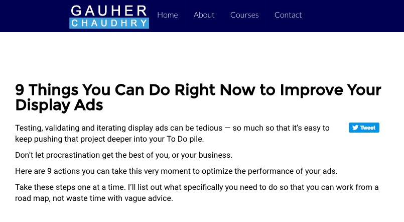
Doing one simple thing: replacing the guarantee with a trust symbol, increased conversions by 107%.
The point of this astounding result is that you need to determine what is important to your customers and find a method that you can include in your emails that appeals to this need. A guarantee helped them feel secure about getting their money back, but they wanted assurance that the watches were authentic. This is why the trust symbol worked better.
Beat the House: Image Test
The Beat the House company, in the gambling industry, decided to conduct a test to see if using an image in their email campaigns made a difference from using a blank white background. They used a photo background page on the control group and a blank page on the other one to see which one converted better.
Results:
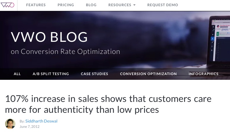
Using an image instead of a blank background led to a 7.46% higher conversion rate than the blank background. The image engaged viewers on a much higher level and encouraged them to click through to the ad. The contents of the picture featured a stack of cards and a lady’s hand holding an “Ace.” Whether the actual content of the picture was the deciding factor or not but it converted better with the image as a background and helped define the brand.
Makelaarsand’s Case Study
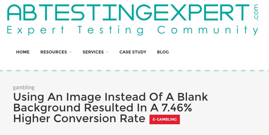
Makelaarsand, a German-based real estate company, wanted to see if showing an image with the customer’s desired result increased signups for their service.
They changed the image in the “help” section where people often went for assistance in finding out how to use their site.
Results:
Showing an image with a “SOLD” sign from a previous image of a smiling female increased signups by 89%.
NuFace: The Free Shipping Study
NuFace, an anti-aging cosmetic company, wanted to boost their online presence and sales. They noticed that many people seemed to be interested in the product but didn’t follow through with purchases.
They decided that it might be the cost of shipping. So they added the incentive of free shipping to see if it would increase their orders.
Results:
Adding free shipping increased orders by 90%. So in this example, NuFace figured out that it wasn’t the product that was the problem. It was the cost of shipping. Once they eliminated the customer objection (the high shipping rate), they were able to increase their conversions a whopping 90%!
They only offered the free shipping for anyone purchasing over 75%, so this also helped them make more money on their email deals and encouraged more sales.
SmartWool: Ethics Increased Sales
One fascinating case study regarding conversions and click through rates was the one conducted by SmartWool. They decided to change their design to focus on their “best practices” within the emails and their website.
Results:
Using the best practices page within the email increased the average revenue per visitor by 17.1%.
Ebook Campaign
Michael Aagaard, an eBook author, wanted to raise conversions on his eBook by changing the copy in his bullet points. He added the amount of time it took to read his book in one of the points.
Results:
This one change increased conversions by 18.59%.

The Power of One
It’s amazing how much one little change can make such a big difference in the results. When optimizing your email campaigns, remember the power of one and apply some of these ideas to increase your results.
Remember it’s about finding out what your customers want and giving it to them. This is the same old business tactics that have worked for a hundred years! The only thing that has changed is the technology.
No matter what your current email audience or conversions are, you are always going to need more subscribers to grow in size. This is something we’ve actively been helping thousands of blogs, brands and businesses with for years now. Click here to see how easy it is to start growing your mailing list through AfterOffers solutions.
